Ancillary Research 1: Digipak Analysis 1
05:05
For my research I also wanted to analyse Digipaks from my chosen genre of Indie. I analysed Digipaks from three different bands/artists -
The first analysis is of The 1975's Digipak:

Background info
The 1975 are an
English rock band originating from Manchester. The group
consists of Matthew
"Matty" Healy (lead vocals, rhythm guitar), Adam Hann (lead
guitar), Ross MacDonald (bass), and George Daniel (drums).
The band's origins trace to them
attending Wilmslow High School and playing together as teenagers in
2002. Gigs organized by a council worker led the band to formally sign
as The 1975. Their choice of name was inspired by a Jack Kerouac beat
poetry book. They eventually signed a record deal after their success
with Dirty Hit and Polydor.
They have released four EPs and
two albums. Their self-titled debut was released on 2 September
2013 through Dirty Hit and Polydor, topping
the UK Albums Chart on 8 September. Their second album I like it
when you sleep, for you are so beautiful yet so unaware of it was released
on 26 February 2016, topping both the UK Chart and the US Billboard 200.
In 2017, the band won the Brit Award for Best British Group.
Main image
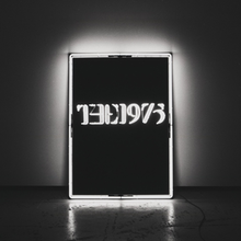
Main image consists of just one photo and there is no additional manipulation to the image. The image is the band's name in wire lighting in a black box. The title is also embedded within the photo itself which we don't tend to see with many DigiPaks. It follows the same design that is also a characteristic of the band which is the name of the band in a rectangle which is used throughout their promotion.
Title

Title in white wire light in a black box. Bright and illuminated, centre of the cover. Font more ambiguous and not straightforward to read.
Layout
Black rectangle centre of the cover. Title positioned directly in the middle. Picture taken from a longshot, we can see the wall, floor and wires from the lightbox. On the actual CD, font is positioned slightly higher up. Back cover just has the tracklist positioned left.
Font
Similar font style throughout, and on the CD. Font is in a Times New Roman style for the band name. Font of tracklist is slightly different and more rounded.
Colour Scheme
Colour scheme consists of gray scale, including blacks, greys and whites. Font tends to contrast the background such on the back cover and front cover however on the CD the title is the same as the background just different shades. The white on the cover is made up of entirely lights which gives it more of an illuminous look and contrasts with the black background - same applies with the white font on the back. Overall the colour scheme is really simple and gives the whole CD a minimalistic look.


0 comments